Project Overview

Graphic Prop

// Dr.Martens // 2026

PROPS

It’s a key interest of mine to find ways to bring together my graphic design knowledge with my handcraft skills. Graphic props are the perfect marriage of these passions. I have worked on several prop projects that develop storytelling in both campaign assets and physical event spaces.

MILK BOTTLES

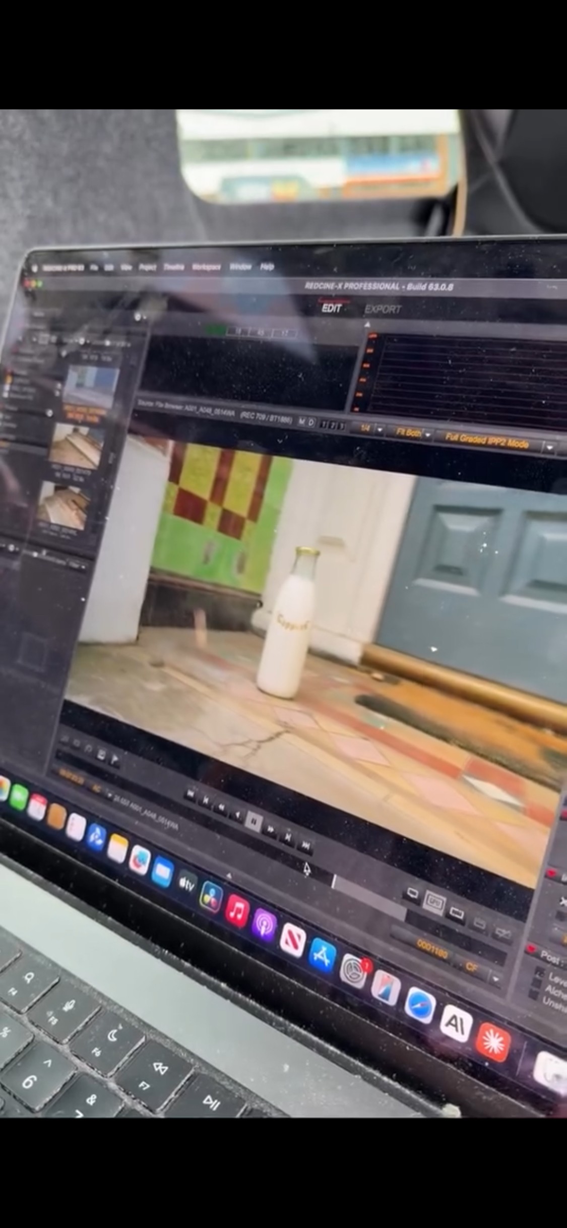
For SS26, Dr Martens reintroduces the archive Capper boot. Inspired by working people, the campaign follows a milkman who brings pride and purpose to his daily route, supporting his community. To extend the storytelling, I created hand-painted milk bottles finished with gold foil gilding featuring the Capper logo from the boots.

(REF) capper boot
GOLD FOILING
ON SET
SYMBOLS

As part of a seasonal launch, the Dr Martens Brand Design team introduced a future-facing visual identity rooted in the brand’s craft heritage, including symbols and iconography.

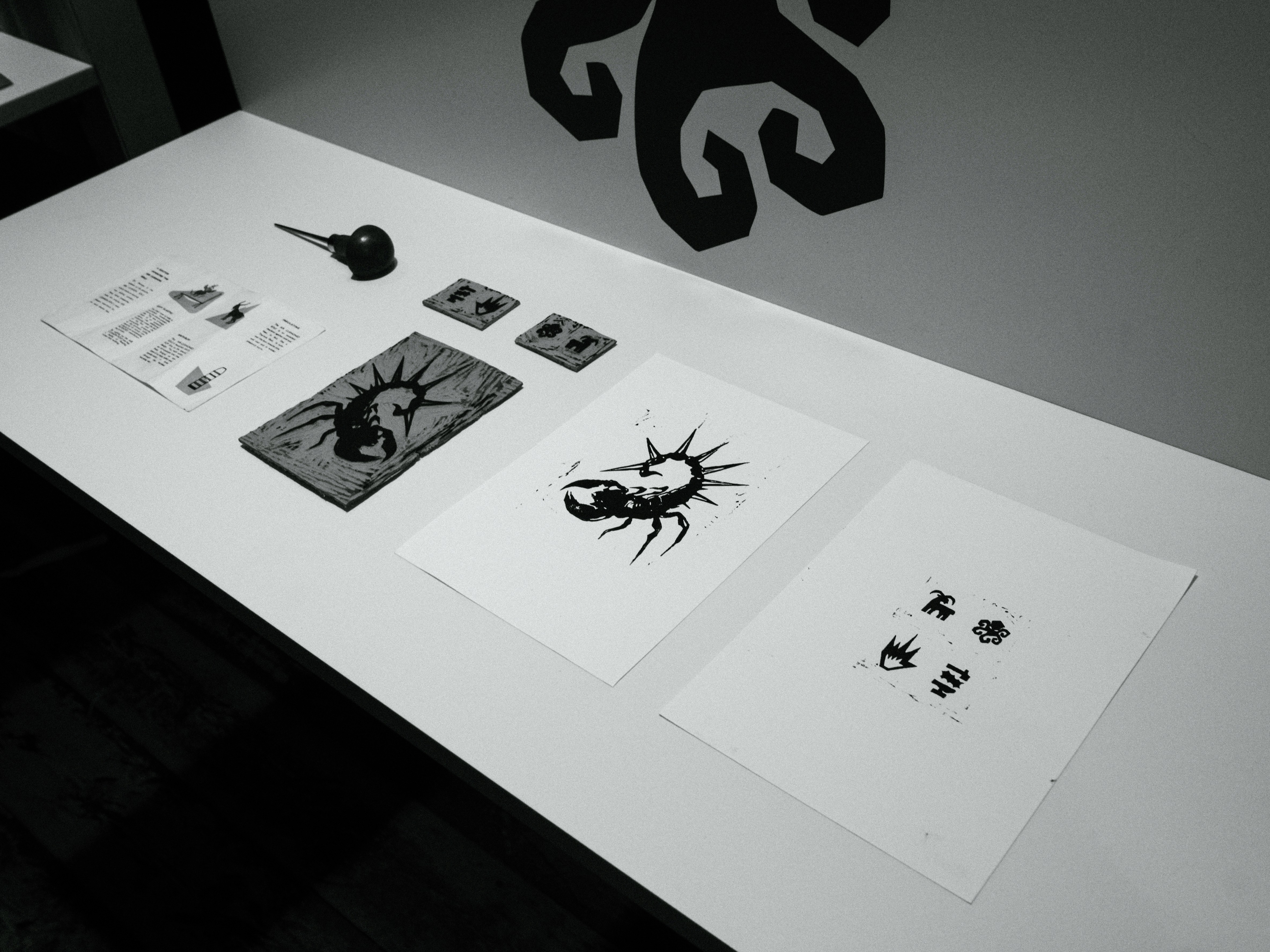
We discovered archival ephemera showcasing Made in England engineering. Inspired by this, I created a linocut display that added storytelling to the event, blending craftsmanship with modern graphic design and inspiring future brand exploration.

(REF) MIE CARE GUIDE
LINO CUTTING
PRINT TEST
Type

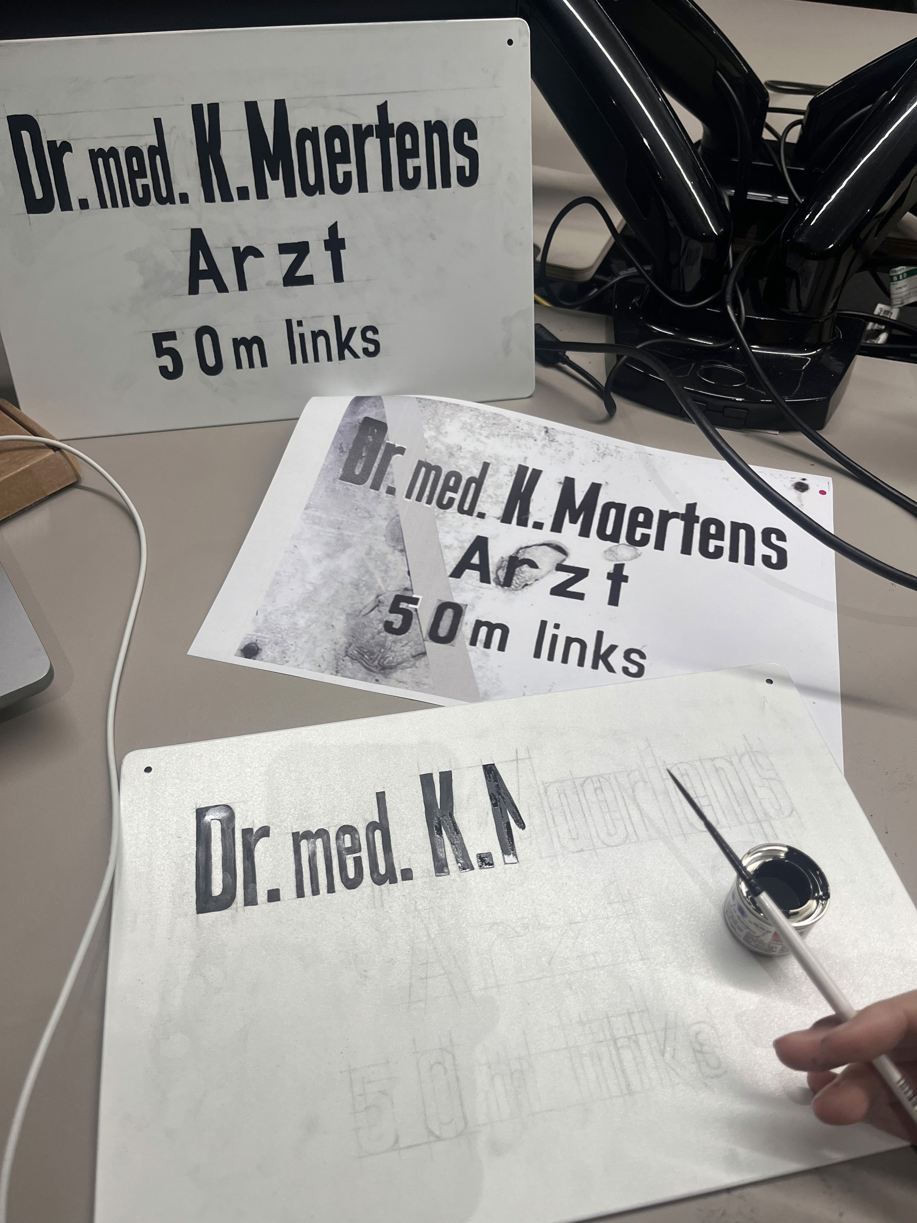
One of the key inspirations for the brand’s new typeface is the original doctor’s surgery sign that led to Dr Klaus Maertens’ practice outside Munich. Although it no longer exists, we felt it was a powerful and essential reference.

For the brand launch event, I recreated it, hand-painting the lettering onto a metal blank and using ageing techniques to replicate wear, ensuring an authentic piece that reconnected audiences with the brand’s origins.

(REF) DOCTORS SIGN
SIGN PAINTING
AGE & WEAR & RUST
Type

For further inspiration, Dr Martens drew on its music heritage and the visual language of old-school gig posters, where bold monotype typography, varied scale, and repeated printing created a characterful aesthetic.

To extend the storytelling, I reformatted reference materials, printed them in a rough DIY style, and used simple ageing techniques to ground them in their original context.

Thanks.